Interviewing & Photographing a Creative
- Daniel Boadu

- Feb 28, 2019
- 5 min read
Updated: Jun 11, 2019
Research for the Assignment:
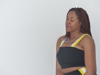
For this assignment, I have decided to interview Destiny Nwadire the CEO of a fashion line called DNA based in Nigeria. The fact that she's the CEO of her own fashion line is relevant to me because I'm currently working towards having my own clothing line during university so that it can start to be established once I have finished. As she didn't have her website up as it was still in maintenance (at time recorded) here's her Instagram page (https://www.instagram.com/dna_byiconicinvanity/).
I decided to research how other fashion magazine companies made theirs for two different reasons. Firstly I wanted to find inspiration in terms of how to go about creating my own and. Secondly, I needed to find a company that I think my interview would feature in, I chose Vogue (https://www.vogue.co.uk/magazine), this is because Vogue magazines focus on what new in within fashion, beauty and culture Destiny's fashion line embodies all of these things. Vogue started out an American weekly newspaper in 1892.
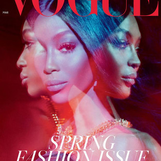

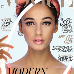


Photo credit goes to:(https://www.vogue.co.uk/magazine)
Research for the layout of the Double Page Spread:
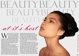


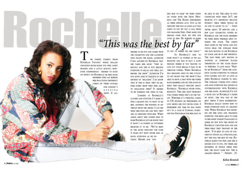

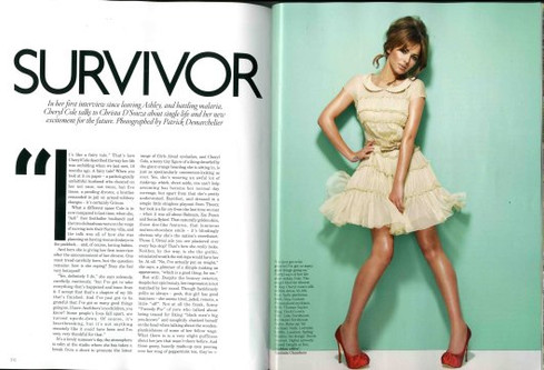
After looking at multiple fashion magazine layouts I have found the these four have caught my attention the most. I believe that it is because they are simple but effective, for example, the body of the text is all black font on a white background (exempting the title), they all only have one photo but that photo shows an element of fashion. This can vary from the pose, clothing or the effect added to the photo; certain photos hold all three features some two and someone. However, each photo carries an element of this.
Research for the portrait of the creative:
I realised that I needed to research a different style when it came to taking portraits of my creative, so I chose to first look at what other fashion photographers had done. Whilst doing this discovered a photographer called Bruce Weber, an American fashion photographer who is most famous for his ad campaigns for Calvin Klein, Ralph Lauren, he has also done work for Vogue and other magazines. (https://en.wikipedia.org/wiki/Bruce_Weber_(photographer))
Whilst looking at his work on his website I found a few of his images that intrigued me.(https://bruceweber.com/photography).


After seeing these six images I had realised that I wanted to link the style of her clothing with the environment/background of the photo. I wanted her to wear her brand's clothing because I wanted to make her the only subject in the photo whilst using the background to not only compliment her but to make her clothing stand out.
Equipment Research:
I chose to use my Panasonic Lumix DMC-fz200 because of its various settings which will allow me to take a multitude of shots. When it comes to editing I have decided that I will use a combination of Adobe Lightroom CC and Adobe Photoshop CC (2019) to ensure my photos come out in the best quality possible. In my opinion, these two softwares are the most useful when it comes to editing photos because I can use Adobe Lightroom CC to tidy up as well as add further detail to the photo. Then if need be import the image into Adobe Photoshop CC (2019) to add effect and change the photo if need be.
Creating the Double Page spread:
When creating this double page I decided to break it down into three different stages. Stage one required me to edit any photos that I was going to use, stage two write out the interview and stage three put it all together. I chose to do it this way because I knew it would be easier and less stressful.

Stage.1
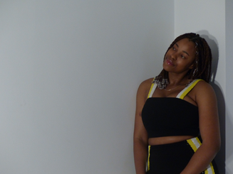
When it came to taking photos of my creations I found it difficult at first. I feel that it was more my fault than hers because I just told to come to my house and we'll just take a few photos so she may have already felt uncomfortable because she's in a new environment. Also due to her being a designer and not a model she has never had to be subjected to photo shoot with her being the subject. Furthermore, she had also told me that she doesn't like taking photos and if I'm honest I didn't really bare this in mind when I was planning the shoot. In a result of this, I found that all these placed unnecessary pressure on her. Due to all these factors, we struggled to get some good shots because I realise that she didn't know how to model and I didn't know how to make her feel comfortable.
So we then decided to do a reshoot but this time I tried to make her feel as comfortable as possible and then we were able to capture these shots. I used the Panasonic Lumix DMC-fz200 because of its intelligence auto mode.
Experiments:


After getting these shot I chose to open the best to work within Adobe Lightroom CC so that I could fix lighting, colour and visual issues etc (click on arrows to see other images).


Before & After:


Stage 2:
The second stage was the most simple part in my opinion; this is where I interviewed her, this was done via email. I then copy and pasted her email into a pages document, checked through it to make sure that there weren't any grammatical errors. I then wrote an introduction and it was ready to be placed in the magazine.


Stage 3:
I then put had to put it all together on Adobe Indesign cc 2019 I found the software easy to use if I'm honest, I didn't really struggle with anything.
I started off by first placing the main image that I wanted to use as the background. Once scaled I used the Gradient Feather tool blend into the white wall. Afterwards, I then added In D.N.A's logo as the title page.


After doing that I realised that had to make a border around Destiny so that I could use the text wrap tool next. Once it was made I had to change the opacity level for 100% to 0% so that it would be invisible to anyone looking at it. I then made all the text boxes so that I could plan out the layout Once completed I added in the text and told the text covering Destiny to wrap around the left side of her using the Text Wrap Tool. I also added a border with the rectangle tool but when I did certain parts of the images which were overlapping the border which made it look messy. So I used the combination of the Add & Delete Anchor point tools with Selection and Direct Selection tools to make it cleaner by creating little gaps in between where it overlapped and where it didn't.


Final Product:


Comments